Unguarded Waterfront – make that Snowfront
 My wife and I went out for a little walk at Cochituate State Park last weekend. She’s 7 months pregnant right now, so we’re not hiking any mountains these days, but do like to get out and see some nature still. Cochituate State Park is composed of three ponds separated by the Massachusetts Turnpike (I-90) and surrounded by woods. It’s really a nice place, close to home, where we can walk around in the woods for an hour with pretty scenery. As usual when we go on these walks, I brought my camera along. I don’t often get great shots as we are usually out on beautiful clear days with nice weather where the light is hard and boring. Also, my focus is mostly on family time, not capturing great images, though I do often get some fun family shots that mean a lot to me personally. But, just because a photo has personal meaning, doesn’t mean the rest of the world wants to look at it!
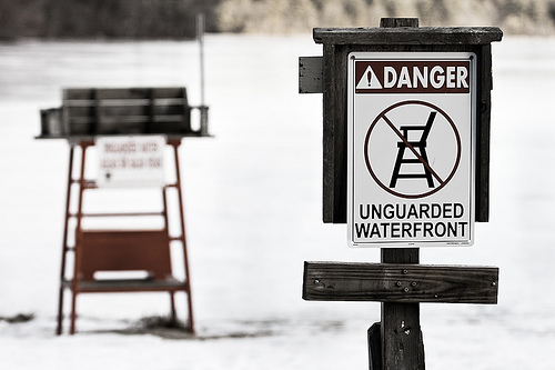
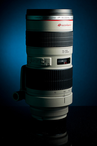 I’ve been trying to get the hang of my new Canon 70-200 f/2.8L, so I brought that along. The lake was completely frozen over, with people ice skating at the far end. We took a walk through the woods, and on our way back stopped on the snow covered beach. Here there were 3 lifeguard towers with signs on them indicating that there were no lifeguards and swim at your own risk. I tried to get some shots of the three towers in a line, but just couldn’t capture anything that seemed interesting. Then, I came along the sign that said “Unguarded Waterfront” with a lifeguard tower, frozen lake, and snow-covered beach behind it. It just seemed somewhat ironic and amusing to me.
I was shooting aperture priority mode (Av) at f/3.2 because I wanted the sign in clear focus with the background blurry, but still slightly identifiable. As it turns out, I am kicking myself for not trying something with a smaller aperture, as the sign on the lifeguard tower is completely indecipherable. If I went back, I’d probably choose f/8 so that the background was a little more identifiable. Because I was shooting a primarily snow-covered scene, I dialed in a slight bit of exposure compensation (EV) – +1/3 stop. Camera meters take what they see and assume that the entire scene would average out to be 18% neutral gray. This is normally a decent assumption and is one of the many reasons why 18% gray cards are used frequently by photographers. Snow isn’t even close to 18% gray – it’s like…2% gray, especially in sunlight. If I were to shoot with no exposure compensation, I’d end up with an underexposed scene because the camera would try to make the snow into gray. I usually have to play with the exposure compensation value a bit to get it right, but as a rule of thumb, when taking pictures of bright snow, bump the EV up a bit, and if taking a picture of your black cat, lower it a bit.
When I downloaded the images last night, I was drawn to this photo. I like the humor of it and I like the way it is framed. What I don’t like, as I mentioned above, is that I chose too shallow a depth of field, so you don’t really know what’s behind the sign. If I had picked something more like f/8 or so, I think the humor would have shined through better.
 Here you see the original image, straight out of the camera and imported into Adobe Lightroom. It’s pretty boring. Almost no color, with little texture in the snow, and no contrast in the wood grain. So, I went to work on it. In Lightroom, I adjusted the white balance to 7100K by using the white balance eyedropper tool and selecting the white of the sign. I usually shoot in Auto White Balance mode when I’m shooting in RAW simply because I can easily adjust it later. With JPG, you don’t have as much latitude there. I bumped up the exposure by +1/4 stop and increased the clarity and contrast some. I also set the tone curve to “Strong contrast”. I knew I would be bringing this into Photoshop and sharpening it there, so I lowered the sharpening in Lightroom to 0.
 Then, I exported it to Photoshop CS4. There, I applied a very strong unsharp mask to the Lightness channel in LAB Mode. This pulled a lot of texture out of the wood without creating halos and odd colors. I also applied a technique used in a few of my other images (as in the one shown here) where I duplicated the background layer, desaturated it, and set the blend mode to Overlay with about a 60% opacity. This has the effect of really kicking up the contrast and making a dull image pop a lot more. The reason for the desaturation is otherwise, you end up altering the colors of the image as well. I also did a slight crop of the image, removing the fence visible in the bottom of the frame, and did some slight adjustment with a levels layer – moving the middle slider to the left to increase contrast. Finally, I added a saturation layer and lowered the saturation of the image by about -50. This had the effect of making it almost black and white, but not quite. Then, I saved it, and exported it to Flickr from Lightroom with medium sharpening.
That was a lot of editing for a mediocre photo, but I’m fairly happy with the way it came out. I’m always trying to stretch myself creatively and in this case I think I had a partial success in doing something slightly out of my normal comfort zone of landscapes.
Leave me a comment and let me know what you think!