Analyzing HTTP traffic with tcpdump and Percona’s pt-tcp-model
I recently ran into an issue where our request throughput was showing very erratic and spikey behavior despite very smooth response times from the application servers. Using Splunk, we analyzed every log that we had: nginx, haproxy, apache, and the application logs themselves and we were seeing similarly spikey throughput. Because those tools all log upon request completion, there was no way to determine from the logs themselves whether it was one tier of the stack in particular that was delaying request arrival, or if it the spikes were endemic to the traffic we were receiving.
So, we decided to perform some analysis of the raw tcp data on the edge server using a couple of tools. First, was tcpdump, which is a tool that should be in every SysAdmin’s arsenal.
First, grab all the traffic on the interface and write it to a pcap formatted file:
tcpdump -c 200000 -w output.pcap -i any
This command will capture 200k packets from any interface and write them to output.pcap, which can be later analyzed with a variety of tools, including tcpdump and wireshark.
All we care about is the actual packet count and only for “real” packets (no SYN/ACKs) on port 80. Extract this data from the capture we just made:
tcpdump -r output.pcap -s 384 -i any -nnq -tttt \
    'tcp port 80 and (((ip[2:2] - ((ip[0]&0xf)<<2))
   - ((tcp[12]&0xf0)>>2)) != 0)' > port80.txt
(I stole this command from the pt-tcp-model documentation and honestly have not dived into the details of how the part after ‘tcp port 80′ actually works).
Producing some data that looks like this (IPs hidden to protect the innocent):
...
2011-10-10 12:49:02.662951 IP 175.x.x.x.ppppp > 10.x.x.x.x: tcp 37
2011-10-10 12:49:02.662958 IP 98.x.x.x.ppppp > 10.x.x.x.x: tcp 1380
2011-10-10 12:49:02.662963 IP 98.x.x.x.ppppp > 10.x.x.x.x: tcp 80
2011-10-10 12:49:02.662965 IP 98.x.x.x.ppppp > 10.x.x.x.x: tcp 463
2011-10-10 12:49:02.662968 IP 206.x.x.x.ppppp > 10.x.x.x.x: tcp 516
...
With a little bash, we can aggregate this data per second (I’m sure that there is a much more concise way of doing this, but it gets the job done):
cut -c 12-21 port80.txt | awk '{print $1}' |  \
      sort | uniq -c  | \
      awk '{print $2 " " $1}' > packets_per_sec.txt
The output looks like this…packets per second grouped by second:
12:49:02 912
12:49:03 2617
12:49:04 2277
12:49:05 1994
12:49:06 2120
12:49:07 2192
Next, it’s some simple gnuplot magic to chart it all out. Here’s the plot file:
set title "TCP Port 80 packets/sec"
set terminal aqua enhanced title "TCP Port 80 - packets/sec"
set xdata time
set xlabel "Time (EST)"
set timefmt "%H:%M:%S"
set format x "%H:%M:%S"
set ylabel "per second"
set datafile separator " "

set style line 1 linecolor rgb "#000000" lw 1

plot 'packets.txt' using 1:2 title "packets" with line ls 1

set terminal png font "/Library/Fonts/Arial.ttf"
set output "packets_count.png"

replot
Run that with
gnuplot file.plot
If you are on a Mac, AquaTerm will probably pop up and show you the graph. If not, you can open the packets_count.png file. What I got, looked like this:
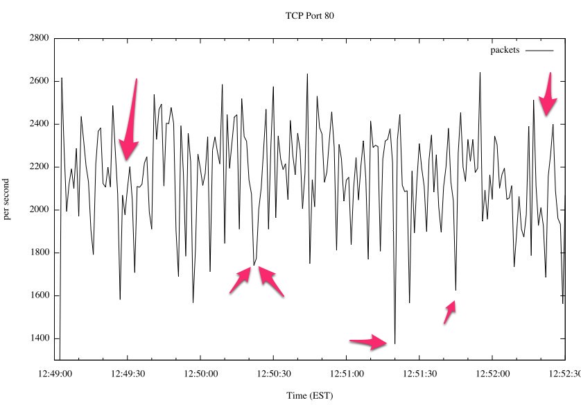
Ugly, eh? I’ve pointed out some problem areas with arrows. The rate of packet arrivals is incredibly variable – much more so than I would expect when the website is receiving 10s of thousands of requests per minute. At such rough granularity, I would expect to see a much smoother line.
That’s great and all…clearly there is a problem, but packets != requests. I want to know how this affects the end user.
Enter pt-tcp-model from the Percona Toolkit (formerly Maatkit by Baron Schwartz, Chief Performance Architect of Percona and author of High Performance MySQL).
In short, this tool will take data from tcpdump and convert the data in the packet headers into time sliced buckets with the number of request arrivals, completions, and other summary data. That can then be charted with gnuplot (or Excel, if you are so inclined) to get some pretty interesting results. To better understand the tool, I recommend you read the documentation and watch Baron’s presentation about Measuring Scalability and Performance with TCP.
First, following the directions verbatim, extract the data into requests and their response times, and slice that into 1 second intervals. One thing to note is that if your source data (port80.txt) contains more than about 300k lines, the tool starts to bog down a bit, so I’d recommend trying to work with smaller samples.
# pt-tcp-model port80.txt > requests.txt
# sort -n -k1,1 requests.txt > sorted.txt
# pt-tcp-model --type=requests --run-time=11 sorted.txt > sliced.txt
Now, you have sliced.txt which looks something like this:
1318265342 18.49   578.542   195   171 0.337054 6.232731 9.455878 0.190278 0.443786 0.337054
1318265343 27.51   527.000   527   526 1.000000 27.511997 27.842869 0.348546 0.583430 1.000000
1318265344 20.75   504.000   504   509 1.000000 20.748874 26.378252 1.166846 0.766312 1.000000
1318265345 23.96   461.000   461   462 1.000000 23.963005 32.181679 3.929070 0.679943 1.000000
1318265346 23.60   438.000   438   423 1.000000 23.595860 26.154968 0.421166 0.939690 1.000000
The columns are in the documentation, but in this case, I’m mostly interested in graphing time vs the number of complete requests arriving (columns 1 and 4).
Here’s some gnuplot for that:
set title "TCP Port 80 - arrivals/sec"
set terminal aqua enhanced title "TCP Port 80 - arrivals/sec"
set xdata time
set xlabel "Time (UTC)"
set timefmt "%s"
set format x "%H:%M:%S"
set ylabel "per second"
set datafile separator " "
set style line 1 linecolor rgb "#000000"
plot 'sliced.txt' using 1:4 title "arrivals" with line ls 1
set terminal png font "/Library/Fonts/Arial.ttf"
set output "lblockups.png"
replot
And here is the chart that I ended up with:
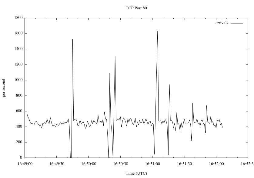
Now…that…is…ugly. When I dig into the raw data, the jagged packet arrival rate is frequently causing 1-2 second delays in the arrival rate of individual requests to our edge server. That is before we even get to nginx, so our app server had no hope. What this means, from a performance standpoint, is that the application stack has to be able to accommodate the huge influx of traffic after the lull. This presents a scalability nightmare, especially for an e-commerce website heading into the holiday season.
Time to call the data center…